Investigating Visual Cue Design for Augmented Reality Piano Playing
Research question: Is added visual cue complexity beneficial for AR-guided piano playing?
We designed a study and prototype to compare three different designs of augmented reality (AR) visual cues for the purpose of guided piano playing. Our results went against expectations, but we identified several patterns which may be useful for future research and implementations of AR for music learning.
- Duration
- 3 months
- Team
- 2 researchers
- Method
- Within-subjects experiment
- Tools
- Apparatus
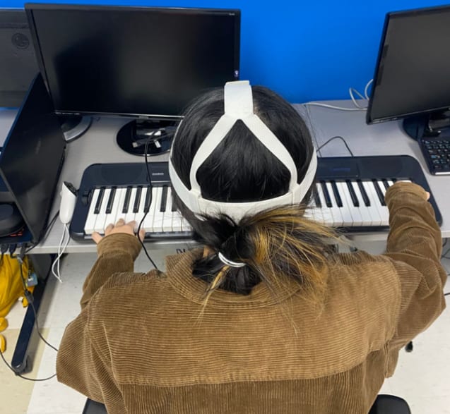
My role included designing the experiment, designing and implementing the AR visual cues, creating the Qualtrics survey, and carrying out the quantitative analysis in R. See details
The Problem
Previous research has demonstrated that AR and mixed reality improves music learning outcomes, motivation, and engagement. This is in part owed to visual cues implemented in an overlay to indicate which notes to play, when to play them, and how to play them on the physical instrument.
However, these visual cues can vary greatly in terms of complexity. While simple visual cues are intuitive, complex visual cues introduce more possibilities for guiding users. But there remains a gap in our understanding of how design complexity can affect users. Thus, we investigated how visual cue design complexity affected usability, performance, and user experience in a simple AR-guided piano-playing prototype.
Method
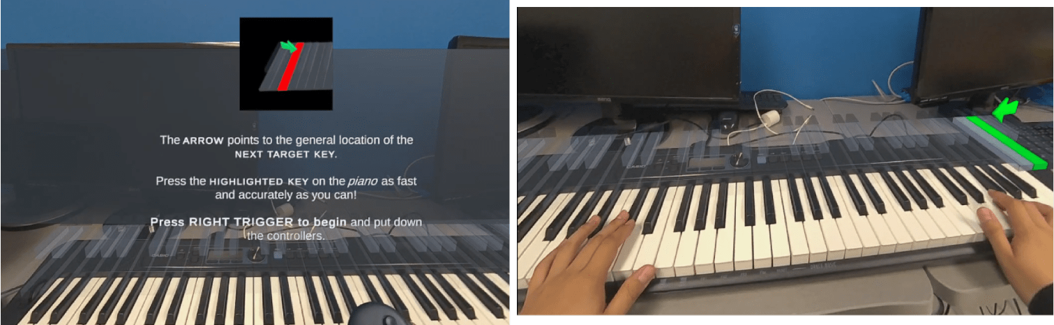
Three visual cue designs varying in complexity were evaluated in this study, each representing a more fundamental design that has been used in previous research and applications.
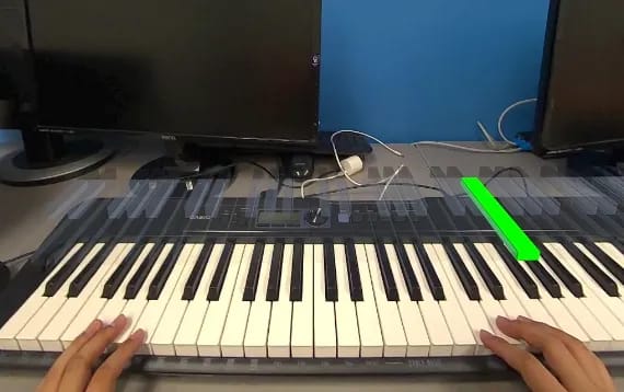
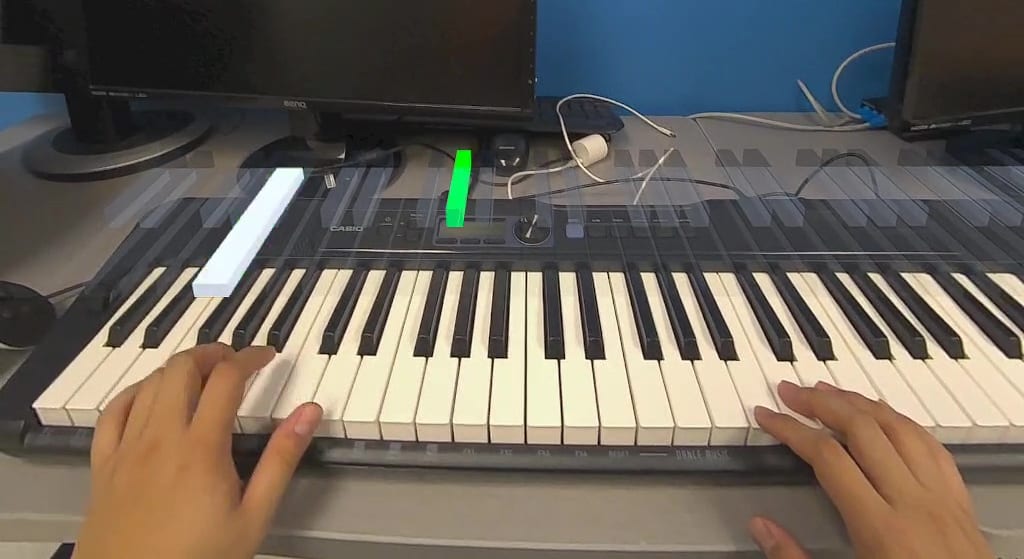
Cues one piano key at a time.
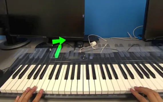
Cues one piano key and provides a spatial predictive cue for the general location of the next key through a directional arrow.
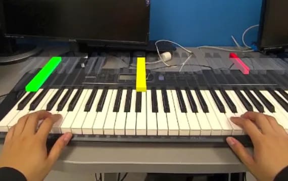
Cues three piano keys at once (i.e., multitarget cueing), using conventional stoplight design to indicate keypress order (Green > Yellow > Red).
Participants
9 participants recruited using convenience sampling. Mean age of 24.5; 8 reported previous experience with AR/VR, 5 with previous piano playing experience, 4 with previous experience in both.
Task
A piano key(s) was cued in the AR overlay according to the design that the user was presented with. The experiment only continued after a correct keypress.
Experiment Design
Within-subjects experiment where all participants experienced all three visual cue designs (i.e., three conditions). Each condition consisted of 30 trials (90 total per participant).
A trial was defined as the onset of a cued key until a correct keypress. Incorrect keypresses were recorded as part of a given trial.
Measures
Quantitative: Response time and accuracy.
Subjective: NASA-TLX scores to measure cognitive workload and System Usability Scale (SUS) scores to measure usability, both presented after each condition.
Qualitative: Post-experiment survey with an open-ended question, a ranking of the visual cue designs, and a demographics questionnaire.
Results
While no statistically significant differences were found, several trends emerged from the descriptive and qualitative data.
Single seemed to produce the fastest keypress response while Stoplight seemed to produced the slowest.
Accuracy was nearly equitable across designs, but Direction appeared to produce the most accurate keypresses.
Stoplight was rated with the highest mean NASA-TLX score, suggesting it might be the most workload-inducing design.
Single was rated with the highest SUS score, appearing to be the most usable design.
The more complex cue designs (Direction and Stoplight) were highlighted as leading to potentially more problems but were also seen as providing the most potential benefits.
Some participants had experience with one of AR/VR or piano, others with both. A 3x2 mixed ANOVA showed no significant differences between experience groups.
Response time
Participants appeared to respond the fastest with the Single design (1.53s).
But we found no statistically significant difference in RT between the three cue designs.
One-way repeated measures ANOVA | F(1.16, 9.3) = .56, p = .82, ηp2 = .18 Log-transformed and Greenhouse-Geisser sphericity correction applied
Accuracy
Accuracy looked quite equitable across designs with Single producing the marginally best accuracy (84.9%).
But we found no statistically significant difference in accuracy between the three cue designs.
One-way repeated measures ANOVA | F(2, 16) = .14, p = .49, ηp2 = .07
NASA-TLX
Stoplight appeared to stand out as producing more cognitive workload than the other two designs (44.9).
But we found no statistically significant difference in raw NASA-TLX scores.
One-way repeated measures ANOVA | F(2, 16) = 2.04, p = .16, ηp2 = .20
Analysis of the six individual subscales showed that Temporal Demand trended toward significance (p = 0.07).
Lower is better.
System Usability Scale
Single seemed to stand out as being the most usable design (83.1).
But we found no statistically significant difference in SUS scores. One-way repeated measures ANOVA | F(2, 16) = .46, p = .63, ηp2 = .05
Higher is better.
Qualitative Results
From an informal analysis of the open-ended question and rankings...
Direction's general-location cueing led to more hesitation; Stoplight's multi-key cueing overwhelmed some, and the colours caused some confusion in terms of order. Both were described as more distracting.
When asked to rank the designs in terms of effectiveness, Direction received the most 1st place rankings, and Stoplight received the most 2nd place rankings.
Overall, participants were optimistic and recognized the potential for the technology, particularly for supporting rhythm training and coordination through more effective predictive and multi-key cueing.
Key Takeaways
What we learned about visual cue design complexity from our findings.
Added visual cue complexity may not be beneficial for AR-guided piano playing.
While we cannot answer definitively, our results suggest that the increased complexity of visual cue designs may not be as beneficial as previously thought. Simple visual cues appear to provide a very intuitive experience, which allows users to engage with the task at hand unimpeded.
It is also important to consider that our study did not account for user engagement or entertainment. It may be that these more complex designs offer benefits in these domains and ultimately improve learning motivation. This could offset the potential drawbacks of increased cognitive workload, lower usability, and generally worse performance.
Simpler designs may be fundamentally better for user performance.
Our results are suggestive of a trend in which more complex visual cue design may not necessarily benefit users at a fundamental level. Participants appeared to perform best with the simplest visual cue design (Single). Additionally, the more complex designs were also subject to more scrutiny from participant feedback relating to more distraction.
What allows users to perform best and what we believe may be beneficial for optimizing user performance requires further investigation.
The benefits of more complex designs may come with expensive trade-offs.
Results from our measures suggest that the benefits of more complex visual cue design (e.g., for visual search) may be offset by more cognitive workload and relatively lower usability. Predictive and multikey cueing may be asking users to actively retain and process more information than is optimal.
Future research should investigate how to optimize visual cue design to balance the benefits of more complex cueing with the potential drawbacks of increased cognitive workload and lower usability.
For complex visual cue designs, spatial predictive cueing may be more effective than multitarget cueing.
Our results seem to suggest that the spatial predictive cueing (i.e., the Direction design) may provide the benefits of more complex designs while limiting the drawbacks of the Stoplight design. Though, it may be that designs such as Direction may be less effective in contexts with a larger horizontal range of targets (e.g., a full piano keyboard) due to ambiguity of the predictive cue.
It would be beneficial to compare these more complex designs across a broader range of contexts (e.g., different instruments).
Non-significance can be attributed to methodological and prototype limitations.
Methodologically, we had a small sample size (a priori power analysis suggests 24 participants for our analysis). We also may have had too few trials (90 per participant). This was done to mitigate boredom affecting user performance, as the task employed was quite simple. A more involved task which better replicates music learning may have been beneficial. As well, integrating more graphical and auditory feedback would have allowed for more trials without inducing fatigue or boredom.
Participant feedback centred on the overlay. Our implementation used an approach based on previous research in which the boundaries of the overlay were set manually. This was done due to time constraints and ultimately led to slight misalignment. Additionally, feedback also pointed to minor issues in how the visual cue designs were implemented.